Mobile Responsive
 You might notice that after you add an image or other element to your page that it does not look good on a smart phone. You need to take additional steps when this happens.
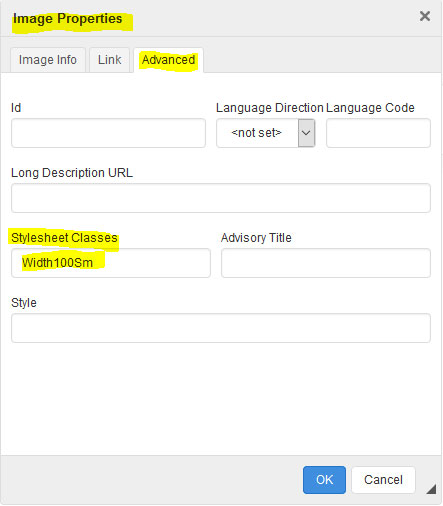
There are some special classes that should make elements behave on a smart phone. Edit the page and open the properties for the image or element.
Definitions:
- Class - this is a name given to a set of styles that you can apply to an object.
- Style - is how you tell the element how to behave. (bold, center, underline, margin and much more)
- Element - is any object on a page. This can be an image, table, paragraph, div, bullet and more.
These classes defined below will start working once the screen is a certain with.
- Md means below 1000px screenwidth (large tablet) Use this with large pictures over 1000px wide.
- Sm means below 768px screenwidth (tablet) Use this with large pictures over 768px wide.
- XSm means below 500px screenwidth (Smart phone) Use this with large pictures over 500px wide.
You only need to use the largest class that you want for your picture or element. The smaller ones will inherit the larger ones.
- CenterMd CenterSm CenterXSm will center an element.
- Width100Md Width100Sm Width100XSm will set the width of an element to 100%. This means that if you add Width100Md class to an image, the image will resize automatically to 100% width on a device smaller than 1000.
- StackTableMd StackTableSm StackTableXSm will break apart a table and stack all columns on top of each other.
- NoVMarginMd, NoVMarginSm, NoVMarginXSm will remove the top and bottom margin from an element.
All of these changes will happen according to the screenwidth. Use one or more classes on an element separated by a space.