Design a Stylish Page Using the Table  Icon
Icon
To create some flair, try a table there!
Placing a table on your webpage allows you to combine different types of design elements on the same plane or on a number of different planes. In one area, or "cell", you can put in interesting text and in the one next to it, you can add an attractive graphic like we designed for you immediately below.
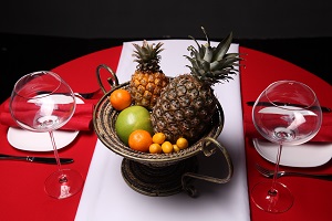
Here is where text concerning your carefully-selected image can go. If you prefer, you can have the image on the left and the text on the right. Whatever text you apply will get more attention than if it was not accompanied by the image, whether on the right or left. Pictures do draw the eye.
|
 |
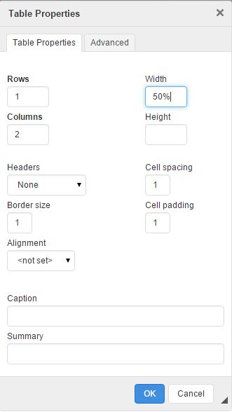 |
Here is another two-cell table. This one spans just 50% of the page unlike the 100% width used for the above table. The image on the left is the window that you get when clicking on the table icon.
|
Here is a table laid out seven columns wide by two rows deep. It contains information that explains all the options available in the Table Properties pop-up window.
| Table Properties: This tab allows you to design how the table will look using the various options available within the Table Properties pop-up window. |
Rows: This field lets you choose how many cells deep your table will be. This table has 2 rows of cells. |
Columns: The number of cells that you want to have stretched across your page is entered here. In this instance, it is a 7 column table. |
Headers: Using this field will cause the text applied to the chosen cells to be in bold font. There are four options available; No headers, In this example, "No headers" was selected so no automatic bolding of text would occur. |
Border size: The number shown in this field denotes how many pixels wide the border around your cells will be. The first two tables on this page have a Border size of 0. The following table has a border width value of 1 while this table has a 5 pixel border. |
Alignment: |
Summary: This field is used if you anticipate a visually-challenged person with a page reader will be visiting your site. It describes the contents of the table but is not visible on your web page without the special reading equipment. You must not use the same words for the caption as you did for the summary or there may conflicts with the data. |
| Advanced: This tab holds tools used mostly by web developers and won't often be accessed by casual users. |
Width: Width values can be in pixels or expressed as a percentage of the width of the page. The default value is 500 pixels. This table is set to 80% of the page. The first two examples were set to 100% while the third example is at 50%. |
Height: For most situations, the height of the cell will be dictated by the height of the tallest image or block of text and can be ignored. You can, however, use this field to manually change the height. |
Cell Spacing: Applying a number to this field will inform the table how many pixels of space you want separating your cells. The examples previous to this table all feature cell spacing of 1 whereas this table has a cell spacing value of 5. |
Cell Padding: No, we're not talking about rubber rooms for nut cases. The cell padding number tells the table how many pixels of space should fit between the contents of the cell and the border. The previous tables on this page all bear the 1 pixel default padding whereas this one was set at 7 pixels. |
Caption: You may apply a headline to a table by entering text in this field. Whatever you type will go above the table such as the caption applied to this table. If you wish, your web developer can change the position from on top of the table to underneath. |
OK/Cancel: When you're done making changes to your table, clicking OK will keep the changes until you can save the page with the "Save Content" button. Cancel is to erase your changes. (The arrow icon beside the OK/Cancel fields is for re-sizing the Table Properties window. Simply click on the arrow and drag to reconfigure.) |


.jpg)